The Peak Predictor
*Last Update: 16. February*
*A video explanation of the Market Cycle Indicator will soon be published*
Pi Cycle Top: 58/100
The Pi Cycle Top compares two moving averages: the 111-day moving average (MA) and the 350-day moving average, which is multiplied by a factor of 2 (350 MA x 2).
Historically, when the 111-day MA crosses above the 350-day MA (x2), Bitcoin is approaching a cycle top.
The Pi Cycle Top indicator has accurately marked major Bitcoin tops in previous cycles, including in 2013, 2017, and 2021. When this crossover happens, it indicates that the bull market is over.
The purple line measures the distance between the moving averages. When the purple line hits the red area, it means that the moving averages have touched.

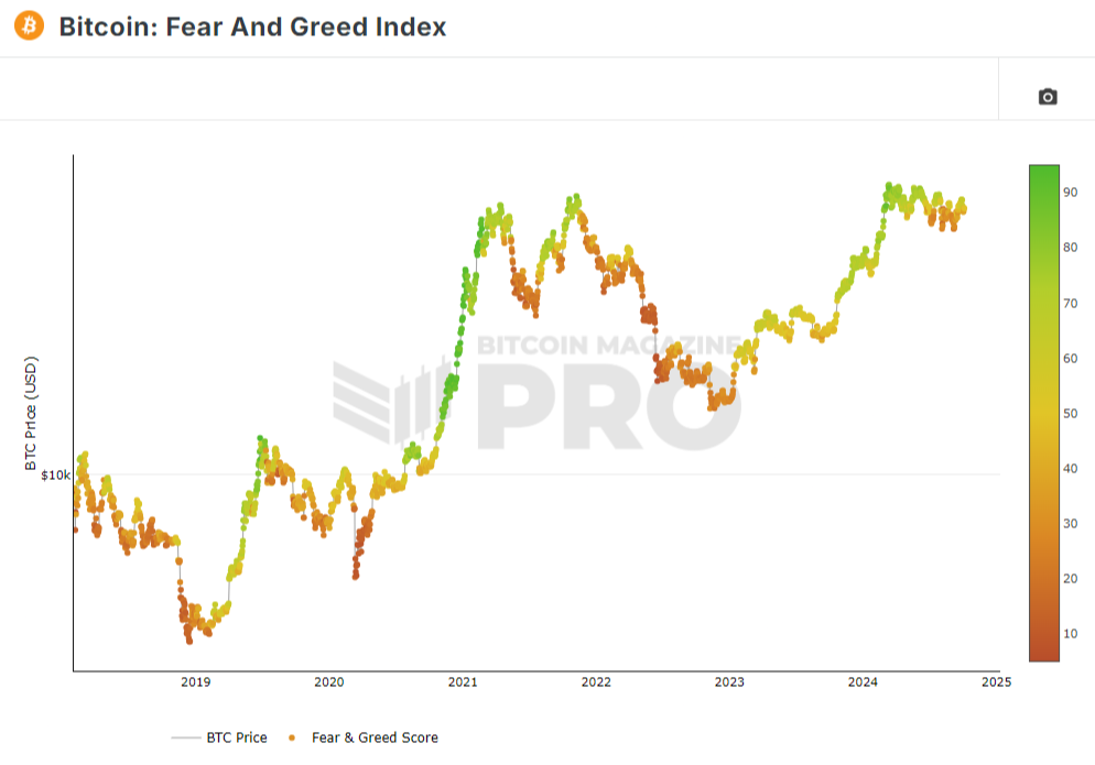
The Fear & Greed Index: 52/100
The Fear and Greed Index uses a simple 0 to 100 scale and is color-coded for ease of use.
When the score is red and close to zero this signals extreme fear and could indicate that many investors are too concerned about the price dropping further.
When the score is green and close to 100 this signals extreme greed and could indicate that many investors are too excited about the prices rising a lot further in the future.
So, the closer we are to 100 the more likely it is that Bitcoin is about to correct or crash.
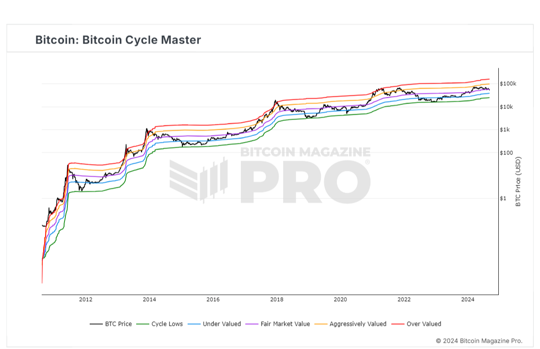
Bitcoin Cycle Master: 50/100
Bitcoin Cycle Master is a combination of on-chain metrics including Coin Value Days Destroyed and Terminal Price. They are able to identify where Bitcoin price is valued relatively within its cycles.
Bitcoin Cycle Master can identify periods of increased risk when transaction behavior on-chain is indicative of major cycle highs. It also identifies areas of value opportunity where on-chain transaction behavior signals major cycle lows.
MVRV Z-Score: 40/100
MVRV Z-Score uses on-chain analysis to identify periods where Bitcoin is extremely over or undervalued relative to its 'fair value'.
It uses three metrics:
1. Market Cap (black line): The current price of Bitcoin multiplied by the number of coins in circulation.
2. Realised Cap (blue line): Rather than taking the current price of Bitcoin, Realised Cap takes the price of each Bitcoin when it was last moved i.e. the last time it was sent from one wallet to another wallet. It then adds up all those individual prices and takes an average of them. It then multiplies that average price by the total number of coins in circulation.
Realized Cap strips out the short-term market sentiment of the Market Cap.
It can therefore be seen as a more 'true' long-term measure of Bitcoin value which Market Value moves above and below depending on the market sentiment at the time.
3. Z-score (orange line): A standard deviation test that pulls out the extremes in the data between market cap and realized cap.
The MVRV Z-score has historically been very effective in identifying cycle tops and bottoms. When the Z-score (orange line) hits the pink box, we're close to the top. When it hits the green box, we're close to the bottom.

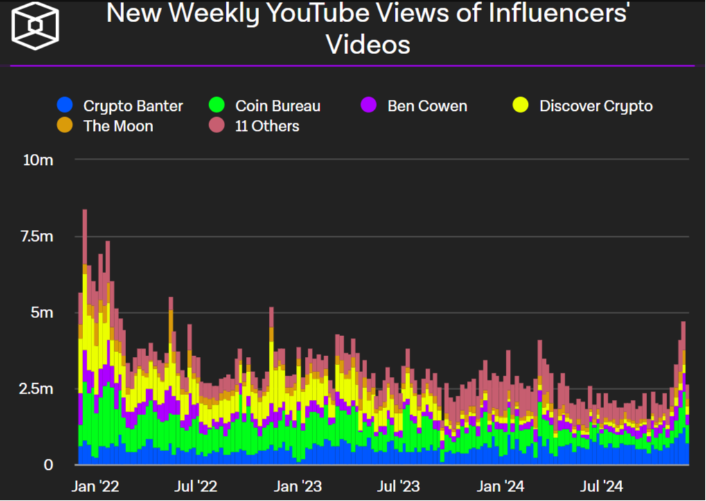
Weekly YouTube Views: 36/100
Historically, we see a massive surge in YouTube views as we enter the final stage of the bull market.
The view count then drops off when we enter a bear market.
Seeing an exponential rise in YouTube views is a clear sign that the cycle top is near.
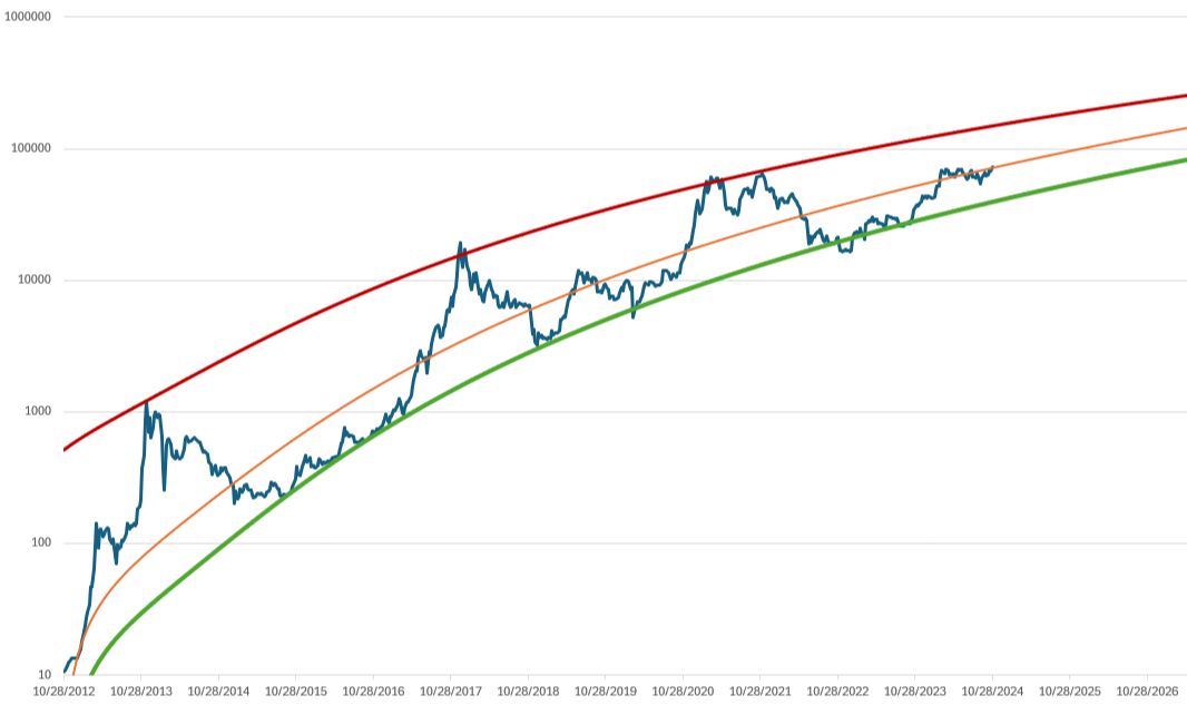
The Power Law Model: 46/100
A regression analysis of the monthly Bitcoin closing price using a power law model.
The model's upper and lower bands are calibrated to significant peaks and troughs, offering insights into potential best- and worst-case scenarios.